PPOL564 - Data Science I: Foundations
Lecture 10
Data Exploration
Lecture 10
Data Exploration
Data Exploration
Concepts Covered Today:
- Initial Exploration of a Dataset
- Basics of Visualization
- Approaches to Data Exploration
- Numeric/Categorical
- univariate/bivariate
Setup
import pandas as pd
import numpy as np
import matplotlib.pyplot as plt # for plotting
import seaborn as sns # for plotting
import scipy.stats as stats # for calculating the quantiles for a QQ plot
import requests
# Print all columns from the Pandas DataFrame
pd.set_option('display.max_columns', None)
# Ignore warnings from Seaborn (specifically, future update warnings)
import warnings
warnings.filterwarnings("ignore")
def download_data(git_loc,dest_name):
'''
Download data from Github and save to the notebook's working directory.
'''
req = requests.get(git_loc)
with open(dest_name,"w") as file:
for line in req.text:
file.writelines(line)
download_data('https://raw.githubusercontent.com/edunford/ppol564/master/lectures/lecture_10/country_data.csv',
"country_data.csv")
# Read in Data
dat = pd.read_csv("country_data.csv")
Data Exploration
Dimensions
dat.shape
dat.columns
dat.index
Determine the unit of observation
dat.head()
Explore the data types
- What are the data types in the data?
- Are they correct?
dat.dtypes
Clean:
yearto integer typecontinentto categorical typeregime_typeto categorical type
dat.year = dat.year.astype("int")
dat.country = dat.country.astype("category")
dat.continent = dat.continent.astype("category")
dat.regime_type = dat.regime_type.astype("category")
dat.dtypes
Categorical variables are similar to factor variables in R
dat.continent.unique()
dat.continent.cat.codes.unique()
Coverage
Depending on the unit of analysis:
- what's the temporal coverage of the data?
- what's the spatial coverage of the data?
min_year = dat.year.min()
max_year = dat.year.max()
print(f"The data ranges from {min_year} to {max_year}.")
dat.country.unique()
There are 122 countries in the data.
Are all countries in the data for the same years? A simple way we can explore this is to plot the spatial unit (if fixed and not too large, on the temporal unit.
sns.set_context("notebook", font_scale=2)
g = sns.relplot("year","country",
hue = "continent",
kind="scatter",
height=30,s=200,
data=dat.sort_values('continent'))

As we can see there are large inconsistencies in coverage. Only a few countries are in the data for the whole 1800 to 2016 time period. Others drop in and out (potentially given their political status). We need to proceed cautiously when using this data in its raw format.
Missingness
- Is there any missing data?
- If so, why is it missing?
- Should the missing values be dropped/imputed/left alone?
# Count the missing entries
dat.isna().sum(axis=0)
# Proportion of missingness
(dat.isna().sum(axis=0)/dat.shape[0]).round(2)
Roughly half the data is missing for four of the float indicators in the data.
- Are these entries missing at random?
- Are they missing for certain units of observation?
- e.g. for specific year ranges or for specific countries?
- What is the best strategy to deal with them?
dat = dat.assign(missing = np.where(dat.life_exp.isna(),"Yes","No"))
sns.relplot("year","country",
hue='missing',
kind="scatter",
height=30,s=200,
palette = ["steelblue","darkred"],
data=dat.sort_values('continent'))

It looks like the life expectancy indicators only cover from 1960 onward. To use these data, we can only consider this time period. Thus, a feasible strategy to deal with the missingness might be to reduce the scope of our analysis to only include 1960 through 2016.
dat = dat.query("year >= 1960").reset_index()
dat.shape
Features of Interest
- Determined by:
- Research question
- Research design
- Data availability
- What is the outcome of interest?
- Economic Growth (GDP Per Capita)
- Population Growth
- Standard of Living (Life expectancy and/or infant mortality)
- What is are the key predictors (independent variables/features)?
- Theory about the data generating process (DGP)
- Features found to be predictive from prior research
- Variable selection model to determine feature importance.
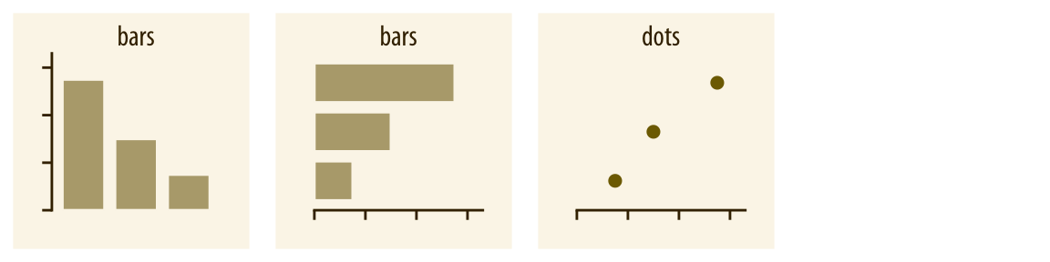
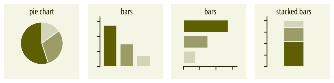
Basics of Visualization
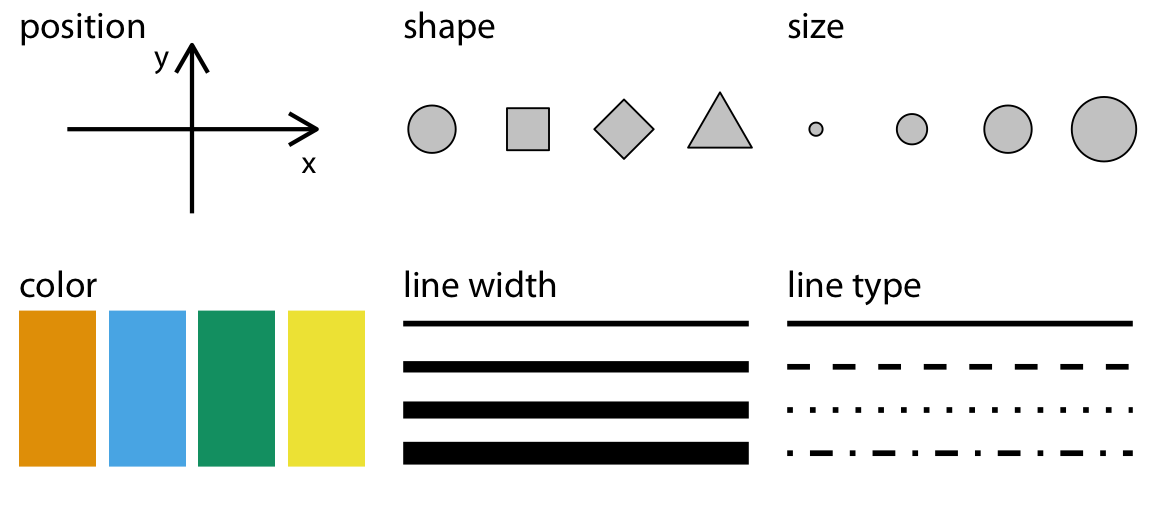
Using Color
Data types drives visualization decisions
| Data Type | Example | Scale |
|---|---|---|
Numerical | 1.3, 800, 10e3 | Continuous Integer | 1, 2, 3| Discrete (when $n$ is small), Continuous (when $n$ is large) Categorical| "dog", "Nigeria", "A"| Discrete Ordered |"Small", "Medium", "Large"| Discrete Dates/Time | 2009-01-02, 5:32:33 | Continuous
Discrete Values 
Continuous Values 
Relationships 
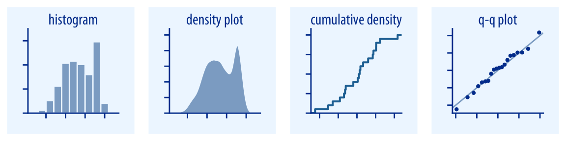
Exploring Univariate Distributions
Numerical Summaries
Continuous Variables
- Five Number Summary:
- Minimum Value
- First Quartile (25%)
- Median (50%)
- Third Quartile (75%)
- Maximum Value
- Moments of the Distribution:
- Mean (central tendency)
- Standard Deviation (Spread)
Pandas offers both these summaries jointly with the the .describe() method.
dat.describe(include="float").round(1).T
Categorical (Discrete) Variables
dat.describe(include="category").T
dat.groupby(['continent']).size()
dat.groupby(['country']).size().sort_values(ascending=False).head()
dat.groupby(['regime_type']).size().sort_values(ascending=False).head()
Visual Summaries
Continuous Variables
# Rest the basic setup
sns.set_context("notebook", font_scale=1.5)
# Set up a subplot using matplotlib
f, axes = plt.subplots(2, 2, figsize=(15, 10)) # set up the
plt.subplots_adjust(wspace = 0.5,hspace = 0.5) # increase the space between plots
# assign a variable
var = dat["life_exp"].dropna()
g = sns.distplot(var,hist=True,kde=False,ax=axes[0,0])
g.set_title("Histogram")
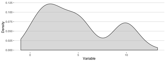
g = sns.kdeplot(var,shade=True,ax=axes[0,1],legend=False)
g.set_title("Density Plot")
g = sns.rugplot(var,ax=axes[1,0])
g.set_title("Rug Plot")
g = sns.distplot(var,hist=True,kde=True,ax=axes[1,1])
g.set_title("Histogram + Density Plot")
plt.show()

Q-Q Plots (quantile-quantile plots)
Compares the empirical distribution to the theoretical distribution. In practice, how normally distributed is our empirical variable.
# With a tehoretically perfectly distributed variable
plt.figure(figsize=(8,8))
x = np.random.normal(0,1,500)
_ = stats.probplot(x, dist="norm",plot=plt)

# With our actual life expectancy variable
plt.figure(figsize=(8,8))
_ = stats.probplot(var, dist="norm",plot=plt)

Histograms
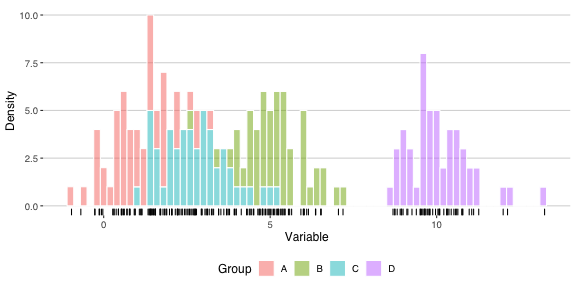
plt.figure(figsize=(15,3))
g = sns.distplot(dat["life_exp"].dropna(),
color="steelblue",
hist=True,kde=False)

For Histograms, bin size can yield a disparate pictures of a variable.
plt.figure(figsize=(15,3))
g = sns.distplot(dat["life_exp"].dropna(),
color="steelblue",
bins=5,
hist=True,kde=False)

plt.figure(figsize=(15,3))
g = sns.distplot(dat["life_exp"].dropna(),
color="steelblue",
bins=100,
hist=True,kde=False)

Using a combination of the matplotlib and seaborn libraries, we can easily generate subgraphs to plot many variables simultaneously.
f, axes = plt.subplots(4, 2, figsize=(20, 15))
plt.subplots_adjust(wspace = 0.5,hspace = 0.5)
sns.distplot(dat["gdppc"],
color="steelblue",
hist=True,kde=False,ax=axes[0,0])
sns.distplot(dat["pop"],
color="forestgreen",
hist=True,kde=False,ax=axes[0,1])
sns.distplot(dat["infant_mort"].dropna(),
color="darkred",
hist=True,kde=False,ax=axes[1,0])
sns.distplot(dat["life_exp"].dropna(),
color="orange",
hist=True,kde=False,ax=axes[1,1])
sns.distplot(dat["life_exp_female"].dropna(),
color="pink",
hist=True,kde=False,ax=axes[2,0])
sns.distplot(dat["life_exp_male"].dropna(),
color="lightblue",
hist=True,kde=False,ax=axes[2,1])
sns.distplot(dat["polity"].dropna(),
color="black",
hist=True,kde=False,ax=axes[3,0])
plt.show()

Scaling Continuous Variables
One thing that should instantly stand out is that the scales differ widely.
# Looking at the QQ plot, we can see the variable is way off from being normally distributed.
plt.figure(figsize=(8,8))
d, x = stats.probplot(dat["gdppc"], dist="norm",plot=plt)

Log transformation
We can adjust the right skewed data with large tail values by taking the natural log of the variable.
# Demonstrate what a log transformation does.
x = np.linspace(0,10e8)
y = np.log(x)
plt.figure(figsize=(15,3))
g = sns.lineplot(x,y)

plt.figure(figsize=(15,3))
x = np.log(dat["gdppc"])
g = sns.distplot(x,
color="steelblue",
hist=True,kde=True)

# From the QQ plot, we can see the variable appears more normally distributed once transformed.
plt.figure(figsize=(8,8))
d, x = stats.probplot(np.log(dat["gdppc"]), dist="norm",plot=plt)

Let's create two new variables that takes the natural log of GDP per capita and Population.
dat['lngdppc'] = np.log(dat['gdppc'])
dat['lnpop'] = np.log(dat['pop'])
dat.head(3)
Standardizing
Standardizes the distribution of the variable by setting the mean to 0 and the variance to 1. This transformation retains the original form of the empirical distribution.
def standardize(x):
return (x - x.mean())/x.std()
# Sim Numbers
x = np.linspace(0,10e8)
y = standardize(x)
plt.figure(figsize=(10,4))
sns.scatterplot(x,y)

plt.figure(figsize=(10,4))
x = standardize(dat["gdppc"])
g = sns.distplot(x,
color="steelblue",
hist=True,kde=False)

Scale by Empirical Range
Scales values so that they exist between 0 and 1, where 0 corresponds with the minimum value, and 1 corresponds with the maximum value. This transformation retains the original form of the empirical distribution.
def range_scale(x):
return (x - x.min())/(x.max()-x.min())
# Sim Numbers
x = np.linspace(0,10e8)
y = range_scale(x)
plt.figure(figsize=(10,4))
sns.scatterplot(x,y)

plt.figure(figsize=(10,4))
x = range_scale(dat["gdppc"])
g = sns.distplot(x,
color="steelblue",
hist=True,kde=False)

Categorical (Discrete) Variables
plt.figure(figsize=(15,5))
g = sns.countplot(y="regime_type", data=dat)

plt.figure(figsize=(15,8))
g = sns.countplot(x="continent",hue="regime_type", data=dat)

Exploring Bivariate Distributions
Numerical Summaries
Continuous Variables
Correlation
Explore the linear relationship between two (or more) variables.
$$r_{xy} = \frac{\sum^i_N (x_i - \bar{x}) (y_i - \bar{y}) }{ \sqrt{\sum^i_N (x_i - \bar{x})^2 (y_i - \bar{y})^2 } }$$
dat['life_exp'].corr(dat['lngdppc']).round(2)
Correlation Matrix
# Expand out to a correlation matrx
dat.loc[:,"polity":"lnpop"].corr().round(2)
Categorical (Discrete) Variables
Crosstabs
pd.crosstab(dat.regime_type,dat.continent,margins=True)
Cross tabs represented as proportions
# By Rows
pd.crosstab(dat.regime_type,dat.continent).apply(lambda x: x/x.sum(), axis=1).round(3)
# By Columns
pd.crosstab(dat.regime_type,dat.continent).apply(lambda x: x/x.sum(), axis=0).round(3)
Categorical + Continuous
dat.groupby(['continent'])['gdppc'].mean().sort_values(ascending=False)
dat.groupby(['country'])['lnpop'].mean().sort_values(ascending=False).head(5).round(2)
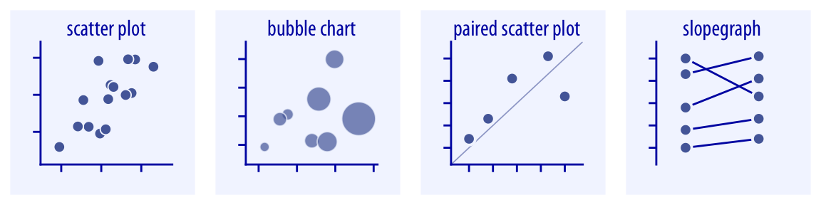
Visual Summaries
Continuous Variables
scatter plot
plt.figure(figsize=(15,5))
sns.scatterplot(x="lngdppc",y="infant_mort",alpha=.6,data=dat)

plt.figure(figsize=(10,7))
# Summarize data
d = (dat
.groupby(['country'])
.mean()
.reset_index())
# plot relationship
g = sns.scatterplot(x="lngdppc",
y="infant_mort",
size='lnpop',
hue = 'lnpop',
sizes=(10, 300),
data=d)

Line plot
plt.figure(figsize=(15,3))
sns.lineplot(x="year",y="polity",data=dat.query("country == 'Nigeria'"))

Univariate and Bivariate Together
sns.jointplot(x="lngdppc",y="infant_mort",data=dat,
height=10)

Fitting the relationship
# Regression line
plt.figure(figsize=(15,5))
g = sns.regplot(x="lngdppc",y="infant_mort",
scatter_kws={'alpha':0.1},
data=dat)

# Higher order regression line: x + x^2
plt.figure(figsize=(15,5))
g = sns.regplot(x="lngdppc",y="infant_mort",
scatter_kws={'alpha':0.05},
order=2,
data=dat)

# Lowess (locally weighted linear) regression
plt.figure(figsize=(15,5))
g = sns.regplot(x="lngdppc",y="infant_mort",
scatter_kws={'alpha':0.05},
lowess=True,
data=dat)

# Regression by Grouping
plt.figure(figsize=(15,5))
g = sns.lmplot(x="lngdppc",y="infant_mort",
hue="continent",
scatter_kws={'alpha':0.1},
height=10,
data=dat)

Heatmaps
# Generate a correlation matrix
corr_mat = dat.loc[:,["polity","infant_mort","life_exp","lngdppc","lnpop"] ].corr()
# Generate a heatmap
plt.figure(figsize=(15,10))
sns.heatmap(corr_mat,
center=0,
linewidths=.5)

Pair Plots
d = dat[['lngdppc','lnpop','polity',"life_exp"]].dropna()
g = sns.PairGrid(d,height=7)
g = g.map_diag(plt.hist)
g = g.map_offdiag(plt.scatter)

Categorical (Discrete) Variables
d = dat.groupby(['continent','regime_type']).size().reset_index().rename(columns={0:''})
d = d.pivot_table(columns="continent",index='regime_type')
plt.figure(figsize=(15,10))
sns.heatmap(d,linewidths=.5,cmap="YlGnBu")

Categorical (Discrete) Variables + Continuous Variables
g = sns.catplot(y="regime_type", x="lngdppc",
kind="violin",
height=10,aspect=2,
data=dat)

g = sns.catplot(y="regime_type", x="lngdppc",
kind="box",
height=10,aspect=2,
data=dat)

g = sns.catplot(y="regime_type", x="lngdppc",
height=10,aspect=2,
data=dat)

g = sns.catplot(y="regime_type", x="lngdppc",
kind="bar",
height=10,aspect=2,
data=dat)
